- Client
Wavemaker - Agency
Mirum - Role
ACD, Product Design - Tasks
UX, UI, prototyping (interactions and webgl animations)
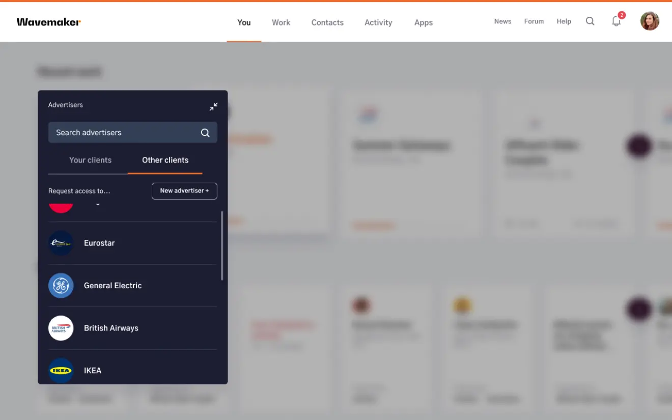
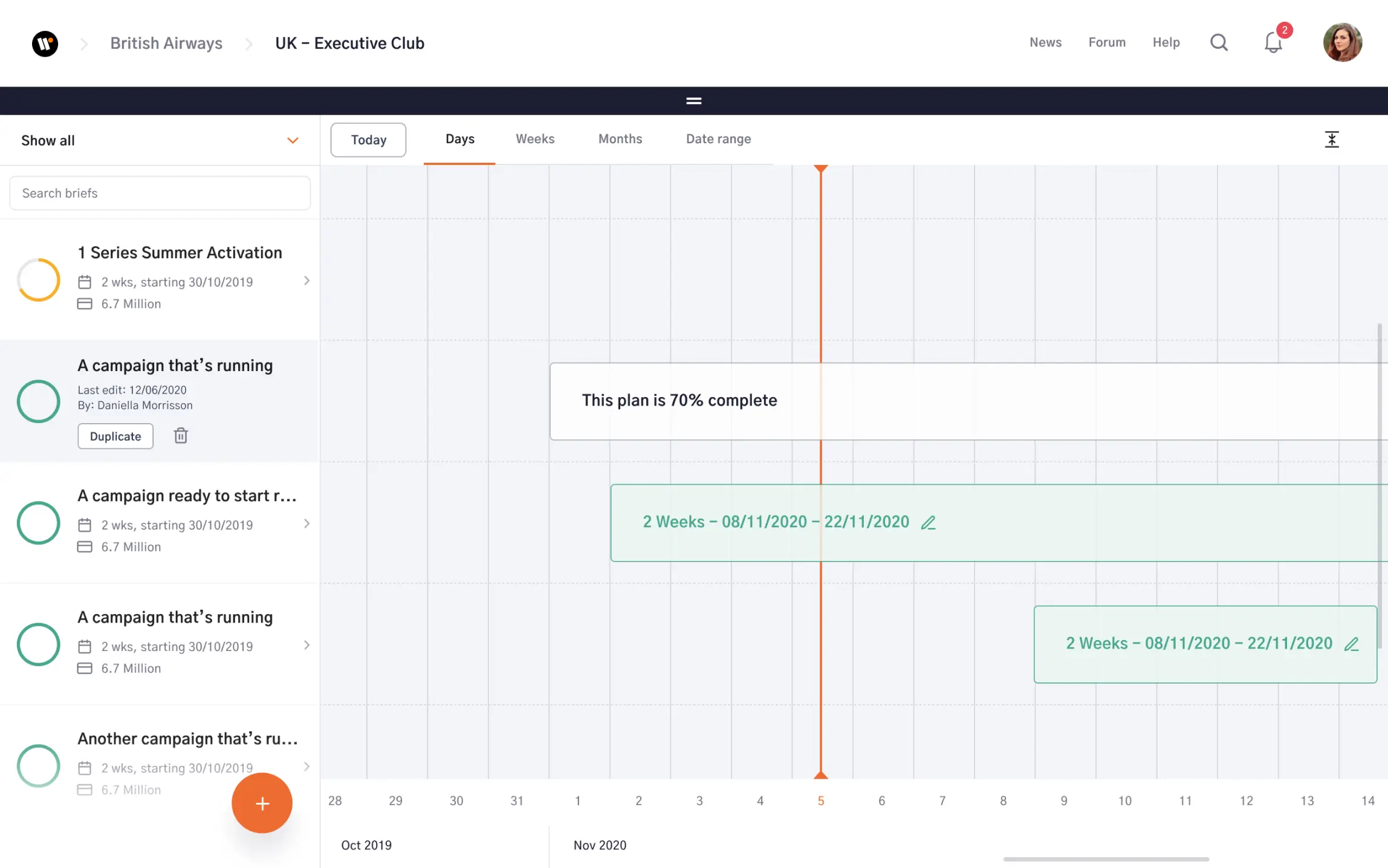
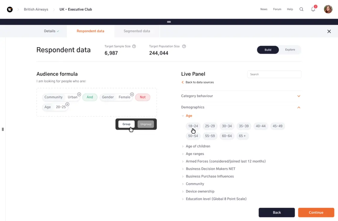
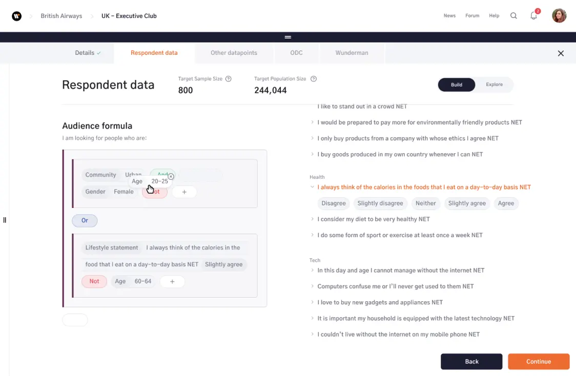
Media planning agency Wavemaker approached Mirum to design a media planning tool, that using machine learning would allow users to build audience profiles and media plans in a fraction of the time it would normally take.
Wavemaker had created a neural net capable of running over 100,000 real life simulations in seconds, shaving weeks off the time it normally takes to create a media spend plan. With the launch just a few months away they came to the realisation that the software they’d developed was nearly impossible for the average user to use. Our job was to fix that.
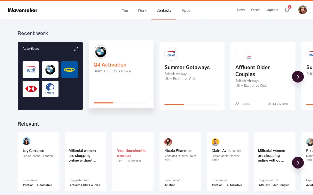
Besides working on the immediate tasks that a user would typically do when using this tool, we wanted to connect the work that each user was doing with the larger network, allowing people to reach out to other users who had knowledge relevant to them.
Our aim was to create an intuitive user experience that our target group would ask to use rather than be forced to use, and we began restructuring the product’s information architecture along with interaction patterns to make sure we were providing an consistent and coherent user experience.
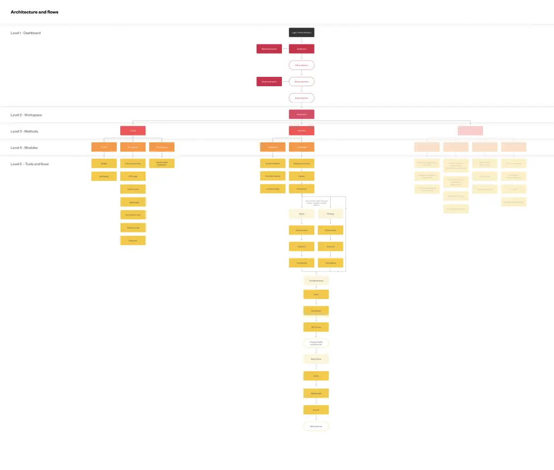
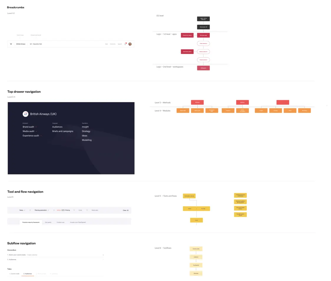
One of our biggest efforts was to constantly make sure that the user understood what was asked of them through every step of every journey. We needed to drastically simplify every interaction pattern and found ourselves drawing inspiration from unconventional sources like music apps rather than competitors.
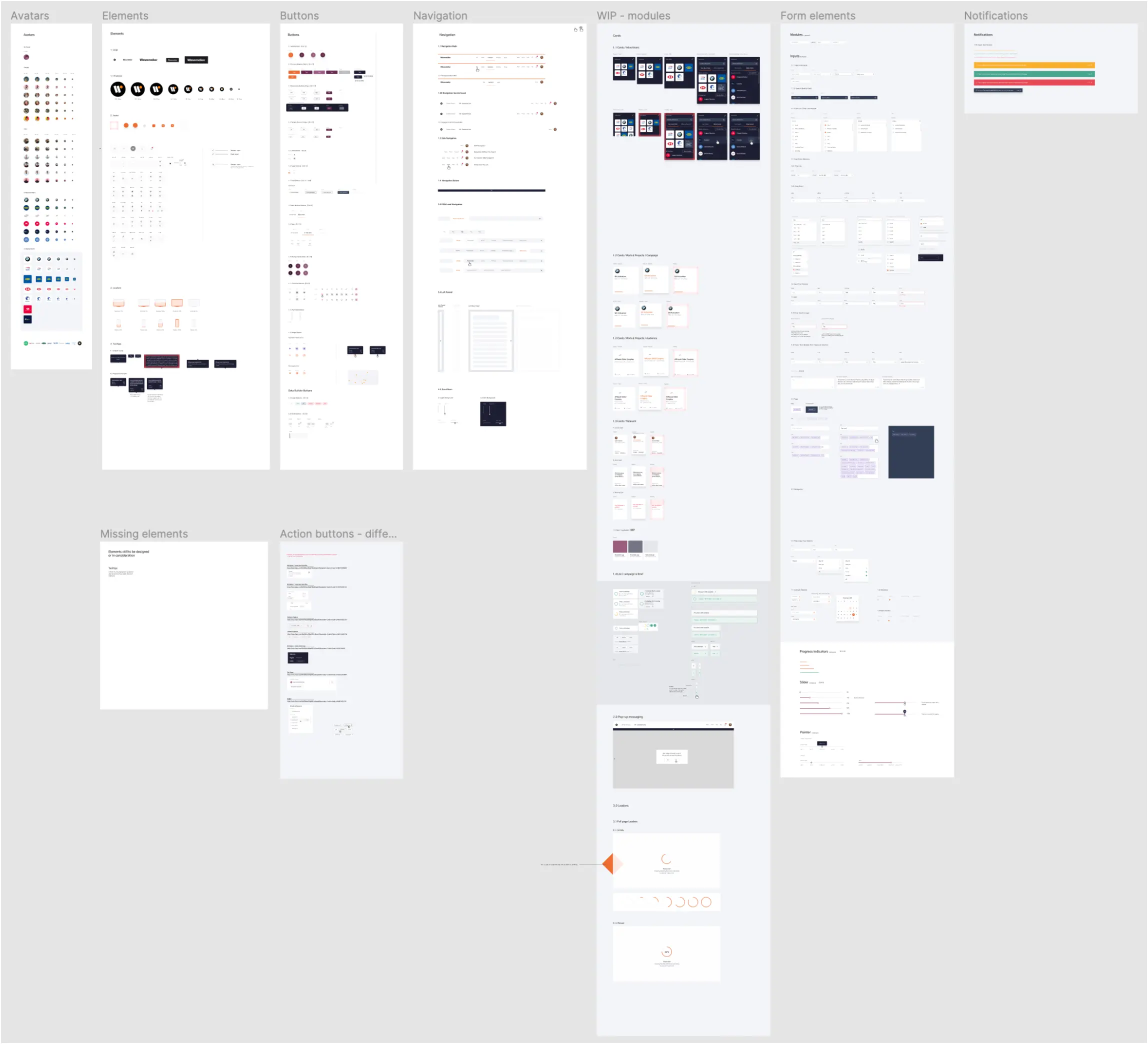
With around 10 designers working in tandem between two countries we needed a collaborative tool and a fundamental design library to ensure visual consistency to all the work
An almost no-brainer in these COVID days, but not such an obvious choice back then, we landed on Figma as our design tool of choice as it eliminated any version history issues and ensured everyone was always looking at the latest designs. We had daily stand-ups to go through new work, and weekly design sessions to discuss limitations or challenges any of us were experiencing with modules or components.
The impact
The tool is now live in 62 markets and currently used by roughly 3,500 people. Before Wavemaker OS, a media plan would take 2 planners, on average, 2 days to complete. With the tool it now takes a single planner 15 minutes.
“The tool has changed the way we work and collaborate as a business, it has delivered efficiencies in key areas of our business as well as facilitating new capabilities for our clients. It has been instrumental in our pitches, in retaining and growing our current clients since it launched. We’ve had such great feedback from users – with usage across over 60 markets - and it’s become a unique differentiator for us.”
By far one of the most exciting projects I’ve ever worked on. There’s nothing quite like joy you get from turning a complex task into a simple interaction.
