
- Client
Specsavers - Agency
Mirum - Role
ACD, Product Design - Tasks
UX, prototyping, user interviews and testing
Specsavers wanted to start selling prescription glasses online and asked for our help to make sure users were able to confidently and correctly submit their prescriptions in order to do so.
Opticians are notorious for keeping prescriptions as cryptic and hard to understand for customers as possible and for leaving out information key to buying the right glasses. With that in mind we set out to make the experience of submitting a prescription to buy glasses online as frictionless as possible.
With a fairly tight deadline I set up a project plan for the team, which consisted of a senior visual designer, a junior UX designer, and me:
- Research: Get a fullstanding of all the prescription values needed to buy a pair of glasses online. Do an audit of the most common prescriptions given out by opticians and optical retailers in the UK. Find benchmark prescription flows online to get an understanding of how other opticians and retailers were doing this.
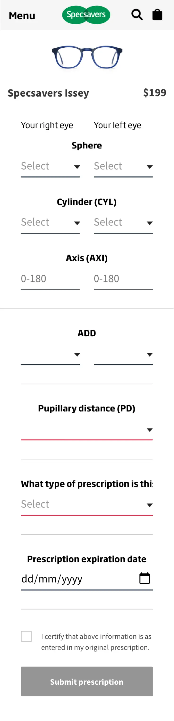
- Design and prototype an initial prescription entry flow using requirements from Specsavers and taking inspiration from selected benchmark flows.
- Run a series of 2-part moderated user sessions. First an interview to get a better understanding of glasses wearers and their prescription; how comfortable do they felt about buying glasses online, did they generally tend to keep their prescription for later use and reference, and did they remember and understand the values listed on it. Secondly a usability test to see if they felt confident entering their prescription values using our prototype and to what extent they were able to enter the values correctly.
- Final definition: Apply learnings from the user sessions to the prototype and run a series of unmoderated usability tests to validate the prototype. Repeat this process to further tweak the designs if possible.
- Deliver designs and annotations to Specsavers’ development team.
Initial learnings
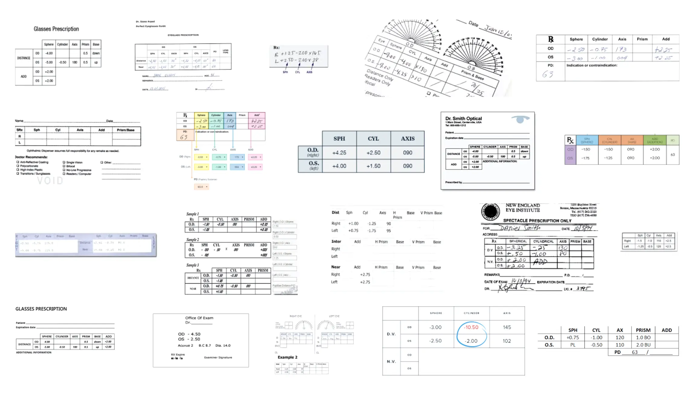
There is no industry standard format for how glasses prescriptions are written out. Terminology tends to be inconsistent – while most values will have similar labels, some will be written down as acronyms, and some will use medical terms rather than language that non-opticians will understand. Furthermore there’s structural inconsistency – data being displayed in tables laid out in different ways and with some opticians opting to exclude values that others might include.
Common practice observed in our online audit seemed to be to “rotate” the prescription table 90 degrees effectively swapping the axes, to make for a mobile friendly layout, but always retaining the optician’s approach of listing right eye before left eye, meaning counter-intuitively users were generally asked to fill in right eye values in the left-hand column and left eye values in the right-hand column.
Prototyping and testing
With a basic understanding of the prescription form I quickly built a prototype that could capture user input and do basic validation. We used half of our user sessions to test the prototype, and a couple of things clearly needed optimisation:
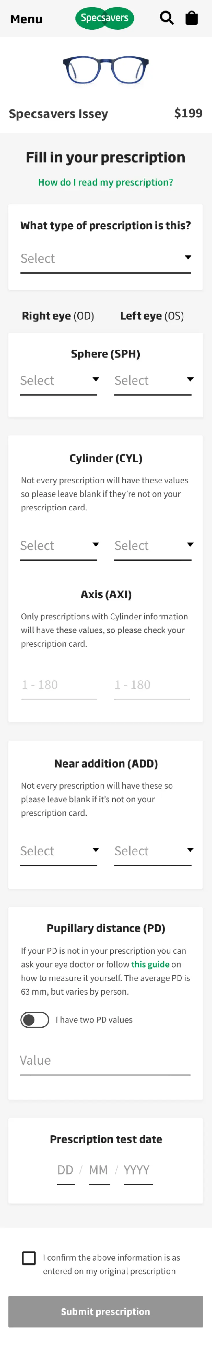
- Our participants were concerned that some of the fields they were asked to fill out weren't present on the prescription we gave them. Half of the users said that in a real life scenario that wouldn't feel comfortable continuing the purchase flow because of this.
- They were jumping up and down between sections and started mixing up values.
Following these sessions we did a second iteration of the designs and created a new prototype, which we tested using online non-moderated tests set up in Validately (Now UserZoom). In this prototype the input fields were grouped and sectioned out with added descriptions to help users better understand that some input fields weren't necessarily needed.
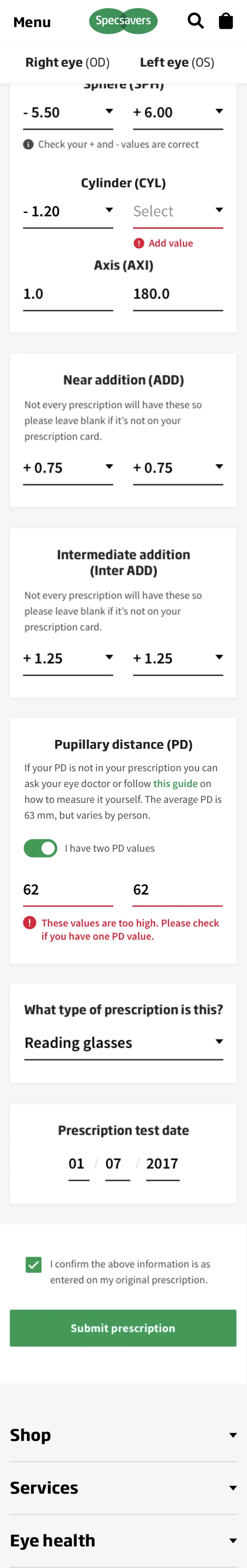
Finally, the third iteration of the prototype introduced advanced input validation functionality, asking users to double check unlikely values such as combined plus/minus or out-of-bounds figures, and a sticky right/left eye header to prevent too much scrolling up and down.
Impact
A wrongly filled-in prescription typically means the customer returns their order. While frames can be sold again, lenses cannot and so keeping the number of incorrectly filled-in prescriptions, and thus returns, low is essential. From the intitial 58% correctly filled forms, our second iteration before the final tweaks were made had improved this to 78%, and the final iteration that went into build reached 96% correctly filled-in prescriptions, significantly exceeding Specsavers’ expectations.