- Client
Thomson Reuters - Agency
Huge - Role
Product Design Lead - Tasks
UX, UI, prototyping (interactions and behaviour across breakpoints)
Through various aquisitions over the years Thomson Reuters had accumulated a whole series of independent self service tools with nothing in common. We were tasked with bringing these together into one ‘My Account’ platform.
The project started out with a discovery phase including audits and heuristic reviews of the existing platforms, stakeholder and customer interviews, as well as competitor reviews. From there we set up three main goals for our work:
- Create a user experience foundation that could house all their various services, which meant setting up rules to maintain consistent interaction patterns and user interface across the platform.
- Create a main entry area and notification framework that at a glance would give users an overview of their account, regardless of whether they were using one or multiple account tools.
- Make managing an account easy and efficient by being intelligent and contextually aware in every task the users needed to perform; avoid asking the user for information that was already available in the backend.
The building blocks a.k.a. our design library
With a just wrapped-up thomsonreuters.com site created by the Huge office in Brooklyn we began to adopt the beautiful and editorial looking designs from the marketing website into a new design system, that could deal with dense and data-heavy tools we were meant to bring together.
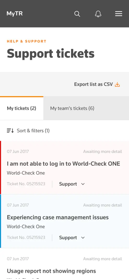
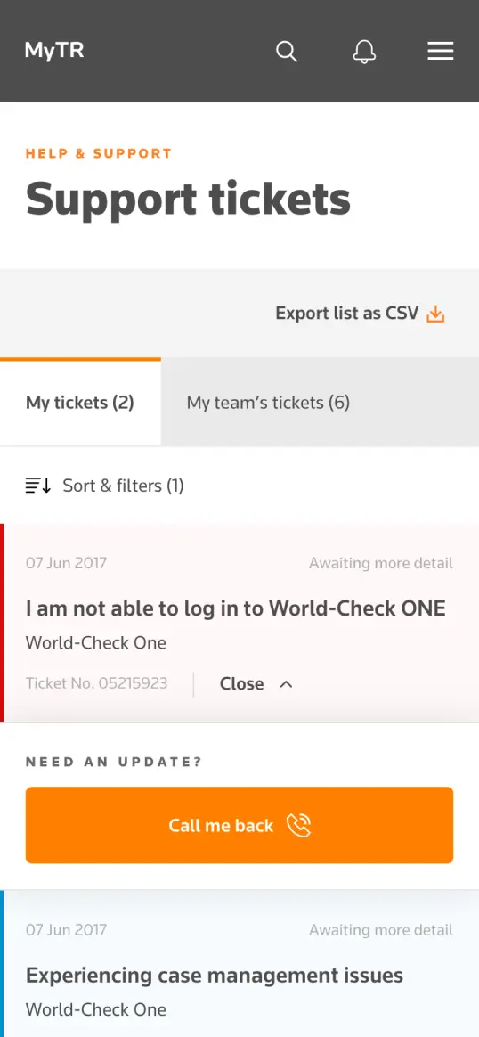
While 90% of the users would be accessing their account from a desktop computer, our aim was to maintain an experience that was just as delightful to use on mobile as on desktop – without compromising on functionality. With that in mind we set up a large library in Sketch, which was expanded and revised during each sprint. Using the plugin Anima Auto Layout we were able to setup padding and margin rules for our all components allowing them to scale consistently across devices and breakpoints, and it also allowed us to easily keep design from earlier sprints up-to-date with the latest changes.
About 2 sprints in, we started sharing the design library with Thomson Reuters' in-house team of designers, who ran sprints in parallel with us. Every sprint we had a check-in session, where we'd introduce them to new modules and components introduced in our latest work and show how they were meant to be used, and they would feed back on the modules introduced to them the sprint before. This process helped us ensure that the design library was robust.
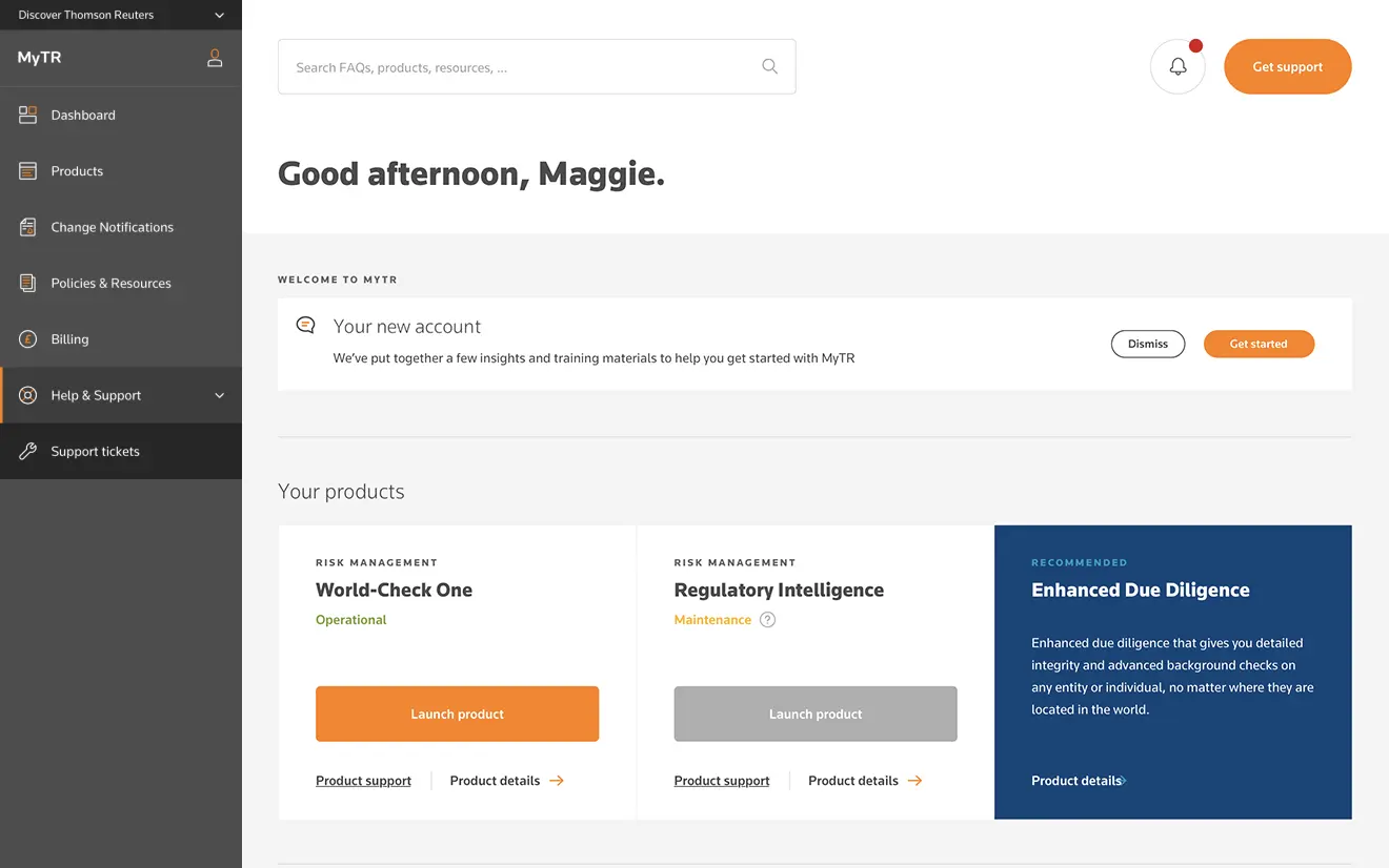
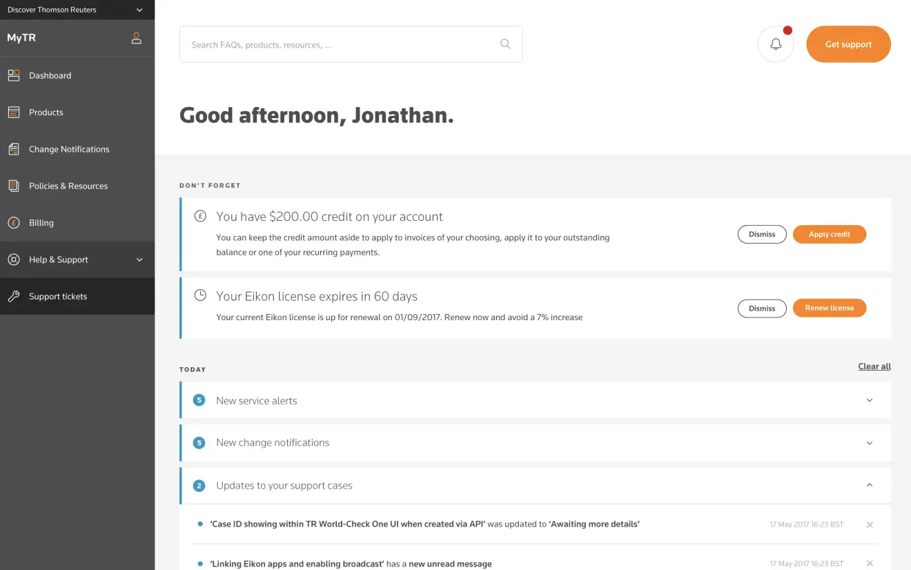
The main dashboard
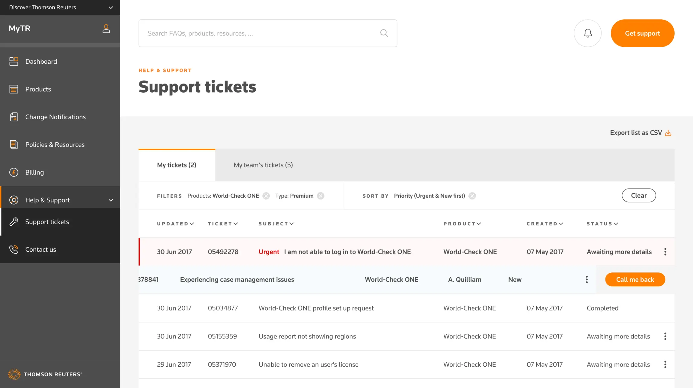
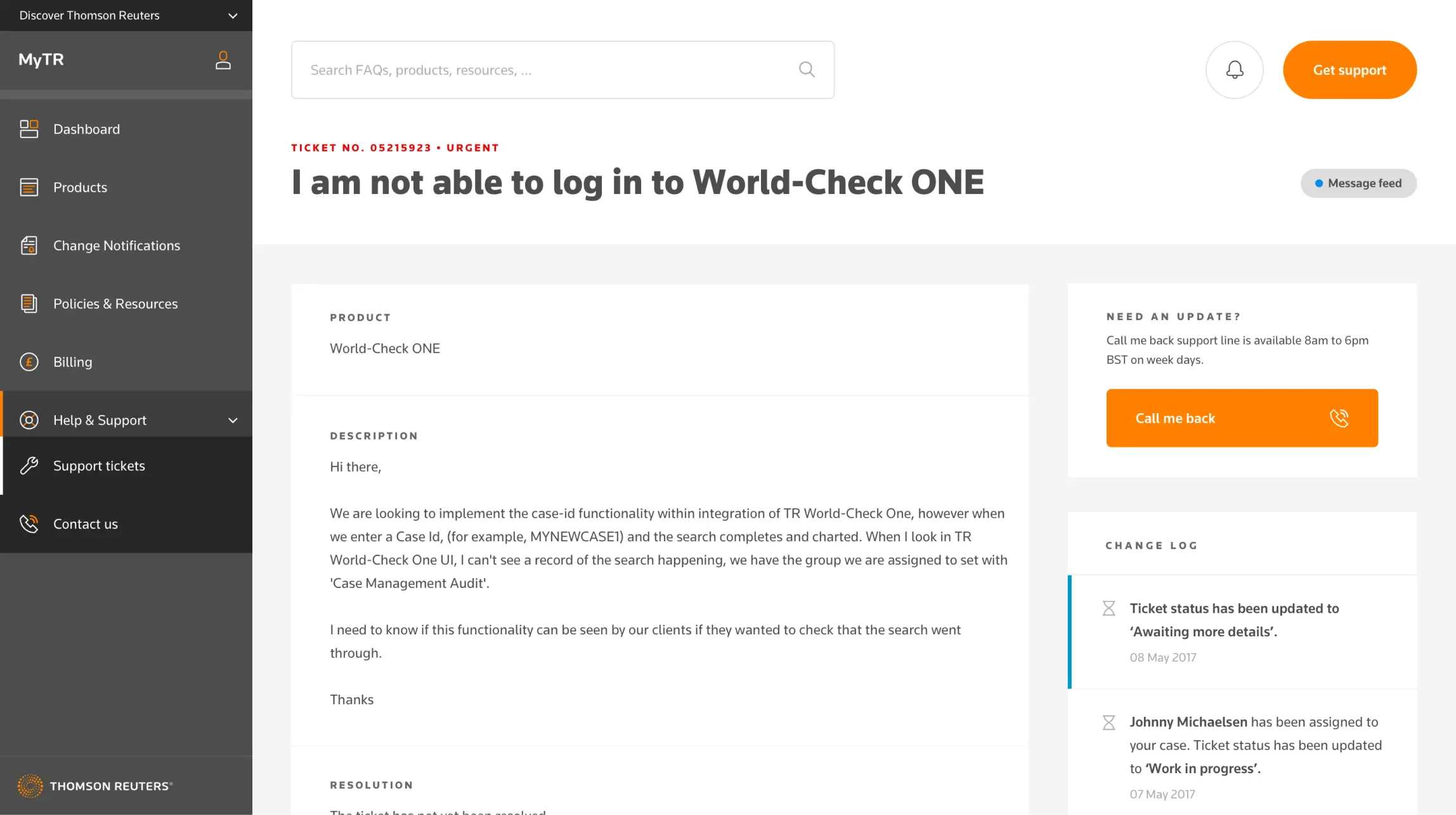
During the approximately 12 sprints the project ran for, one of the things we kept revisiting was the dashboard. Every two or so sprints we’d begin work on a new tool, which meant not just figuring out what that tools would look like and how it would work within this new platform, but also how it would be represented on the dashboard. The main purpose of the dashboard was to give the user an overview of their products and services, but also to provide shortcuts to key tasks. To achieve that we divided our dashboard into the following sections:
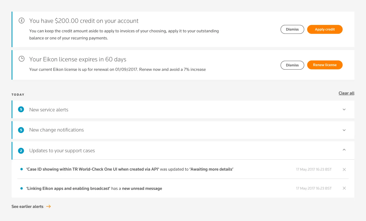
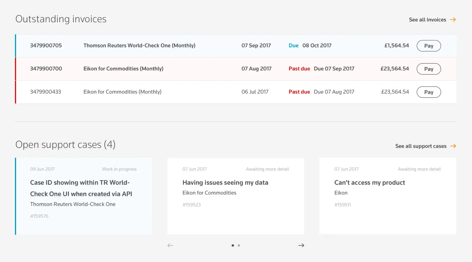
Products and tasks
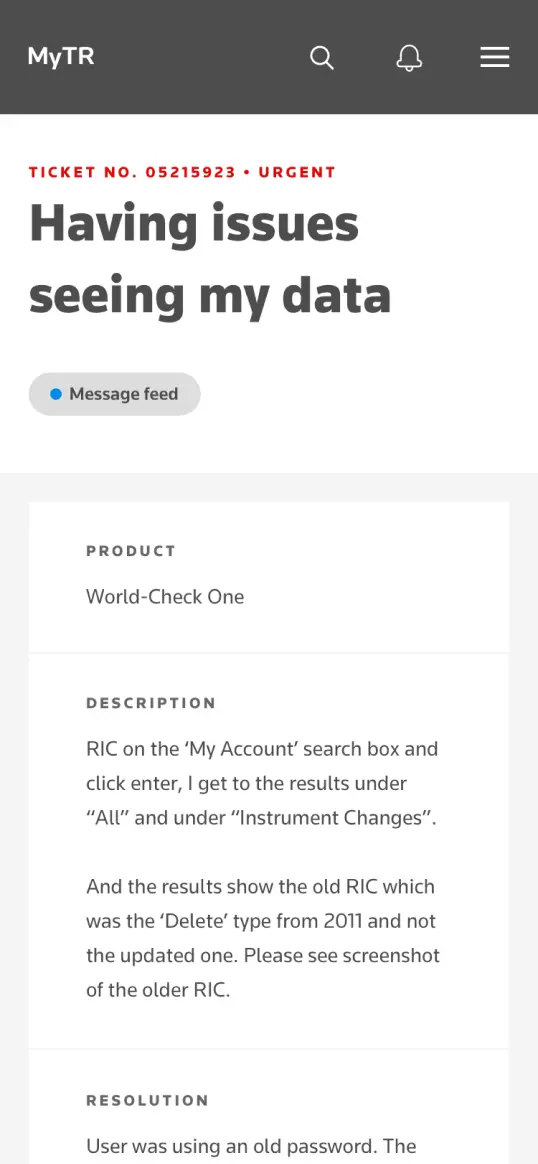
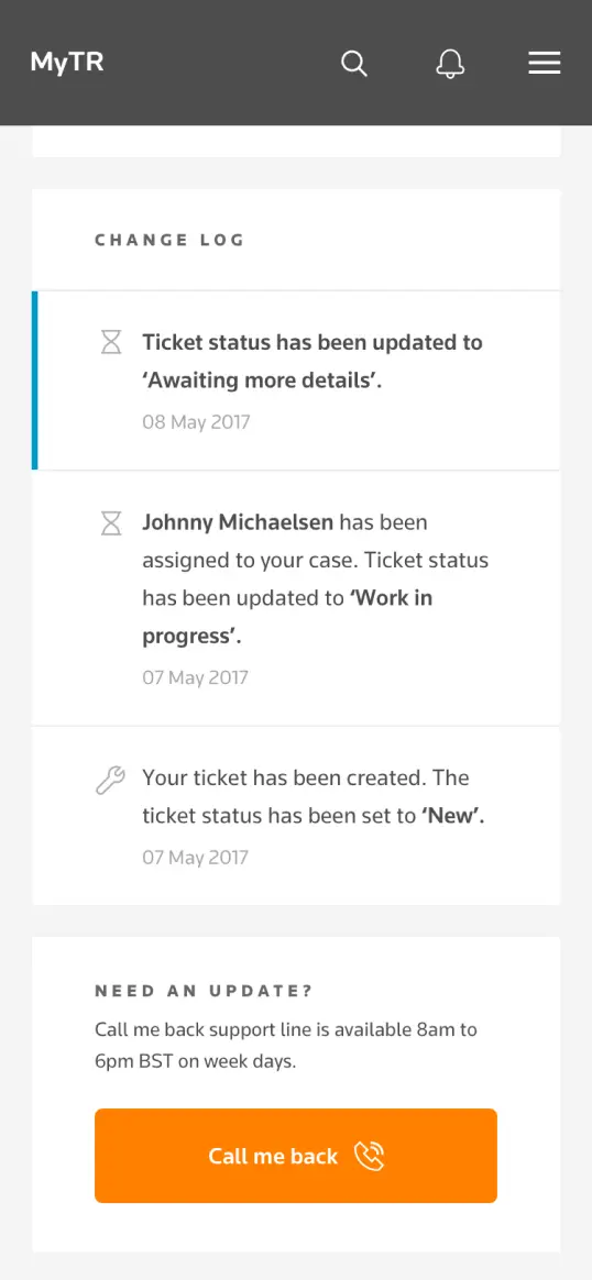
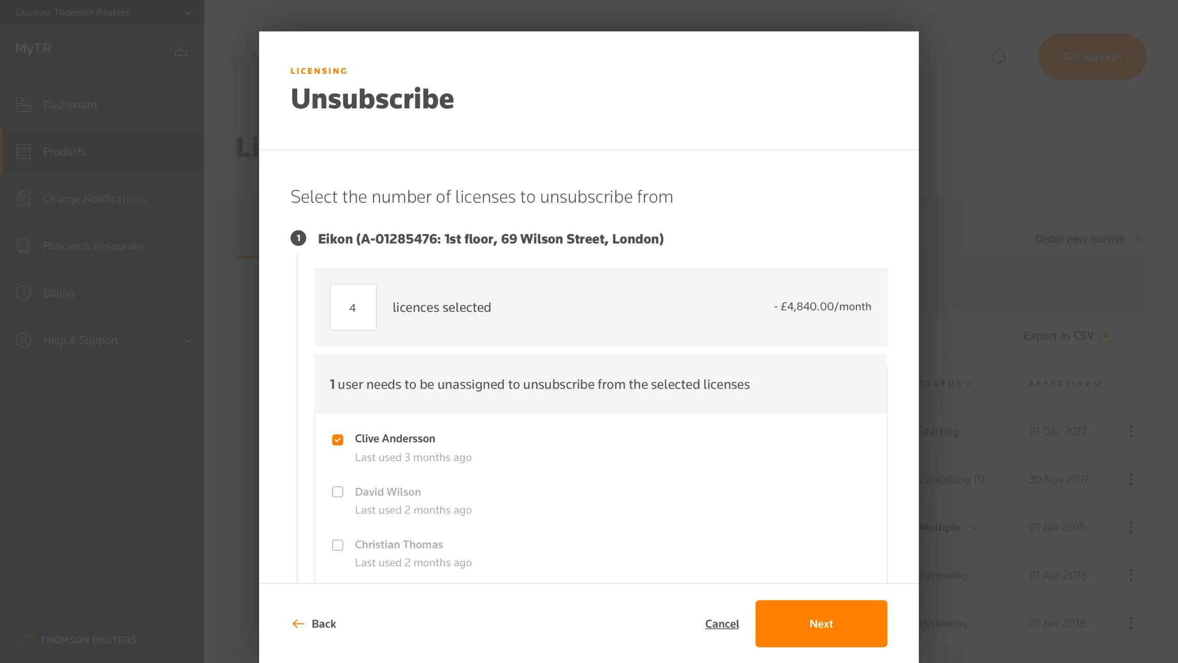
Besides getting the top-down view of the self service system right, we needed to understand how each of the products and services worked down to the smallest details.
Before sprint kick-offs we would be drip-fed user stories and requirements as they were finished and start feeding back, particularly when we felt a back-end system starting to dictate user flows. I collaborated with Thomson Reuters’ business analysts and product owners to work out ways of simplifying their task flows to make users capable of using the system without reading a manual. The key goals here were to bring the amount of steps down, never to ask the user for information we already had, and generally reduce the possibility of a user making errors.